Understanding Accessibility Guidelines for Web and Mobile Applications
According to the CDC, over 60 million Americans have a disability – that’s over 1 in 4 people. Of this number, 13.7% have a mobility disability, 10.8% have a cognitive disability, 5.9% have a hearing impairment, and 4.6% have a vision impairment. With these varied disability classifications, it is imperative to account for the challenges one may face using a website. Guidelines addressing contrast, captions, or path-based input, for example, are designed to enable those with some of the aforementioned disabilities to be able to successfully access and utilize a web content.
In this article, we will discuss the general idea of accessibility and its purpose, as well as the standardized guidelines that ensure web & mobile solutions are accessible. We’ll also touch on some tools that assist in reviewing accessibility conformance.
What is accessibility and why does it matter?
Accessibility refers to designing web content so that all users – regardless of physical, situational, or socio-economic restrictions – can access and use the software successfully. Let’s look at an example.

Without accessibility accommodations, individuals with blindness, deafness, or cognitive limitations may find it impossible to access and utilize web content, such as the text on the left in Figure 1. While seemingly of minimal difference to someone without a visual disability, the text on the right in Figure 1 meets all WCAG contrast ratio requirements and is therefore more likely to be visible to someone with a vision impairment.
Accessibility ensures a broader audience and enables the utilization of web content without rendering tasks impossible for those with disabilities. Accessible content removes confusion and hindrances for these users.
What is WCAG?
As the leading organization for web standards, the World Wide Web Consortium (W3C) maintains a series of guidelines, including the Web Content Accessibility Guidelines (WCAG), for making web content accessible to all users across all user agents. While it is not possible to cover every situation for every person, the concept of accessibility has the goal of trying to maximize the number of users that can successfully interact with web content. As of publish date of this article, the latest set of WCAG standards is 2.1. While WCAG 2.2 success criteria have been published, they are currently in Working Draft state. Therefore, unless noted otherwise, the use of WCAG in this article refers only to WCAG 2.1 standards.
Structure
Four Principles compose the foundation of WCAG. Each individual principle then comprises several guidelines, 13 in all. These guidelines, in turn, are further divided into a total of 78 testable success criteria. Even more, some success criteria have multiple conditions that come into play. Finally, each success criterion is assigned A through AAA – lowest to highest – to identify the level of conformance. So, if achieving minimal conformance were desired, focus would be only on those success criteria assigned Level A. While this hierarchy may seem a bit much, W3C is kind enough to provide a filterable Quick Reference.
When thinking of accessibility, many people – developers included – go straight to keyboard accessibility and navigation. While keyboard accessibility is certainly important, it’s specifically pointed to in just one of the 13 Guidelines and covered by only four success criteria. WCAG, then, must be more expansive. The four Principles – Perceivable, Operable, Understandable, Robust – address a wide range of topics; some examples are shown below.
Principle 1 – Perceivable: Information and user interface components must be presentable to users in ways they can perceive.
Example Success Criterion: 1.4.1 Use of color – Color is not used as the only visual means of conveying information, indicating an action, prompting a response, or distinguishing a visual element.
As shown in Figure 2, color, symbols and text are used in combination to indicate an action’s success or an item’s status.
Principle 2 – Operable: User interface components and navigation must be operable.
Example Success Criterion: 2.1.4 Character Key Shortcuts – If a keyboard shortcut is implemented in content using only letter (including upper- and lower-case letters), punctuation, number, or symbol characters, then at least one of the following is true:
- Turn off: A mechanism is available to turn the shortcut off
- Remap: A mechanism is available to remap the shortcut to include one or more non-printable keyboard keys (e.g., Ctrl, Alt)
- Active only on focus: The keyboard shortcut for a user interface component is only active when that component has focus.
As shown in Figure 3, shortcuts using just letters to select options from a dropdown menu are acceptable if they are active only when the dropdown has focus.
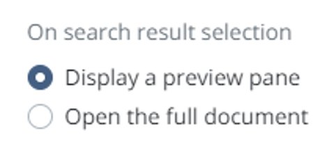
Example Success Criterion: 2.4.6 Headings and labels – Headings and labels describe topic or purpose.
As shown in Figure 4, the control labels describe the purpose of each radio button, providing a clear and concise description of the input field and its purpose within the context of the surrounding content.
Principle 3 – Understandable: Information and the operation of the user interface must be understandable.
Example Success Criterion: 3.2.3 Consistent Navigation – Navigational mechanisms that are repeated on multiple Web pages within a set of Web pages occur in the same relative order each time they are repeated, unless a change is initiated by the user.
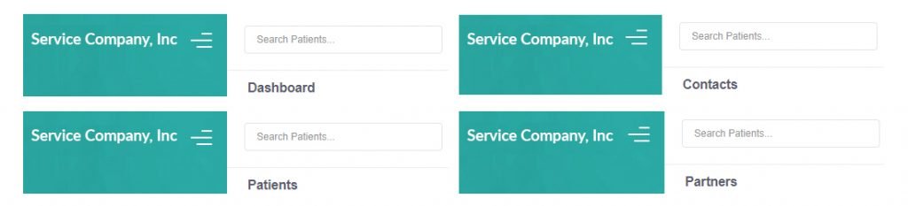
Figure 5 shows a global patient search box as a feature of the header area. It’s consistently displayed at the top left of each page and can be accessed from any location throughout the application.

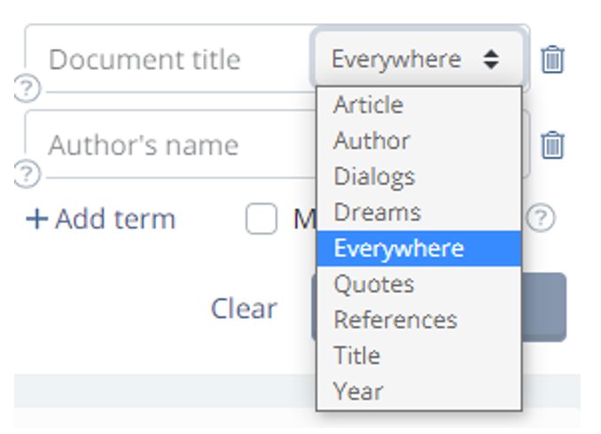
Example Success Criterion: 3.2.4 Consistent Identification – Components that have the same functionality within a set of Web pages are identified consistently.
In Figure 6, we see three separate controls which all perform the same functionality but are inconsistently identified.
Principle 4 – Robust: Content must be robust enough that it can be interpreted by a wide variety of user agents, including assistive technologies.
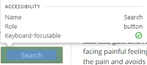
Example Success Criterion: 4.1.2 Name, Role, Value – For all user interface components (including but not limited to: form elements, links and components generated by scripts), the name and role can be programmatically determined; states, properties, and values that can be set by the user can be programmatically set; and notification of changes to these items is available to user agents, including assistive technologies.
In Figure 7, the search button’s name and role are specified, so they can be programmatically determined.

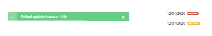
Example Success Criterion 4.1.3: Status Messages – In content implemented using markup languages, status messages can be programmatically determined through role or properties such that they can be presented to the user by assistive technologies without receiving focus.
In Figure 8, the resulting message after performing a search is considered a status message and therefore requires the appropriate role or property.
Conformance
Each individual success criterion’s page has an abundance of details – explanations of its purpose, examples of scenarios where the success criterion applies, sufficient techniques to meet the requirements, and common failures. All this information is provided to help developers achieve conformance.
But what does conformance even mean here? Is it simply meeting the requirements of a Success Criterion? WCAG conformance means:
- All Success Criteria are satisfied for a given level (A, AA, AAA)
- Pages must conform in full, rather than partially
- Complete processes must conform across all pages
- Only accessibility-supported ways of using technologies are relied upon to satisfy success criteria
- Technologies used in non-accessibility-supported or non-conforming ways do not render the page inaccessible
Legal Obligations
In the United States, Title III of the Americans with Disabilities Act prohibits discrimination based on disability; however, it is unclear how this impacts web content. Courts have differed on whether the ADA requires web content operators to make websites and apps accessible to those with disabilities, but recent trends in complaints, litigation, rulings, and opinions has shown WCAG 2.1 Level AA to be sufficiently ADA compliant.
Section 508 of the Rehabilitation Act of 1973 focuses on eliminating barriers in information technology for people with disabilities in Federal agencies. These requirements extend to private websites only if they are contracted with a federal agency or receive federal funds. In 2017, Section 508 was updated to adopt WCAG 2.0 success criteria as its standard.
A list of the United States’ laws and policies regarding accessibility, and the related WCAG guidelines used, if any, can be found on W3’s website.
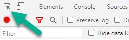
DevTools
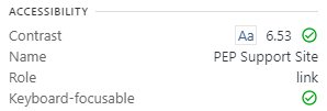
It’s all well and good to know the guidelines and requirements for WCAG, but how can you check whether your web content or a site you utilize is accessible? Helpfully, Chrome’s DevTools – which we discussed in an earlier article – provide a few ways to check if certain accessibility requirements have been achieved on a webpage. The first can be done through the element inspection tool. Using this tool to hover an element on the page will bring up some information about that element’s accessibility metrics in a tooltip. Here, you’ll see Contrast, Name, Role, and Keyboard-focusable. While clearly not covering the entirety of the success criteria for any given conformance level, these items provide a quick snapshot of some important and common requirements.
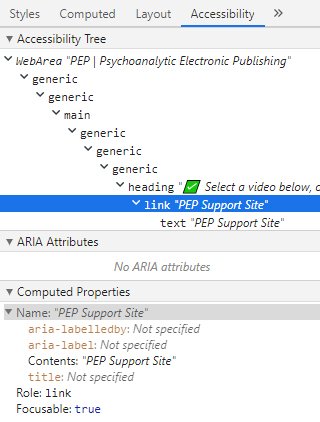
Alternatively, opening the Elements tab and selecting a line will focus on that element. Selecting the Accessibility tab will then open multiple sections of interest for accessibility purposes. Computed Properties is where you can find Name, Role, and Keyboard-focusable as seen previously. While a bit more in depth than this article aims to go, it’s necessary to note that ARIA (Accessible Rich Internet Applications) attributes – seen in Figure 11 – are important for assistive technologies and are discussed in multiple success criteria.
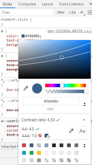
For contrast ratio, switch from the Accessibility tab to the Styles tab. Clicking the color square opens the color picker. Then, expanding the Contrast ratio field in the color picker, you can see what colors would meet requirements. When this field is expanded, two lines are shown on the color picker: one for conformance at Level AA and one for Level AAA. Anything on the same side of the line will give the same result; i.e., if the contrast ratio currently does not meet requirements, picking a color on the same side of the line you’re currently on will also not meet requirements.
Lighthouse
Chrome gets more in depth with accessibility conformance with Lighthouse. Selecting the Lighthouse tab in DevTools will open up options for a variety of reports that can be run.
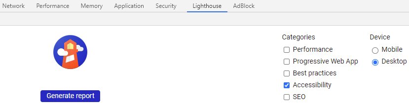
Under the Categories heading, there is a checkbox for Accessibility that ensures the audit will look for accessibility issues on the currently focused page. Under the Device heading, you can choose between desktop and mobile to make sure the web pages you plan to review conform for both environments. When ready, click the Generate report button. Lighthouse will run through a series of tests to evaluate the accessibility of the page.
Once complete, an Accessibility report will be generated. The report includes an overall Accessibility Score, as well as a varying number of headers that can be expanded to see specific elements. Mousing over an individual element will highlight it on the page, while selecting the element in the report will take you directly to its line of code.
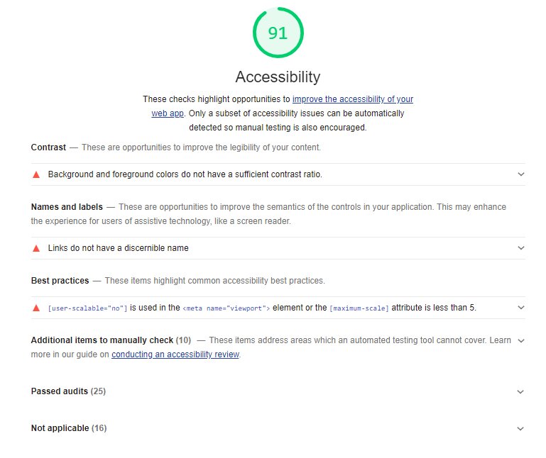
Though the Audit Report is an extremely useful tool to use when reviewing conformance to accessibility guidelines, it should not be used to replace a manual review of the conformance of web pages. There are certain things Lighthouse cannot test for, like logical tab order, so having a human review these items is necessary and advised.
Closing Thoughts
With more than 60 million people in the United States having a disability, web accessibility should be more than an afterthought. Taking steps to ensure those with various impairments can access and utilize your web content not only increases your audience and customer base, doing so can also help avoid potential lawsuits. While implementing and conforming to the WCAG guidelines laid out in this article can certainly be a heavy lift, accessibility ultimately proves worthwhile.
 Strategy for Modernizing Monolithic Applications
 The "Frankenstein" Cloud Software Application